Rebrands are supposed to be a way in which brands and companies refresh their image to reengage with their current audience and to appeal to potential new audiences. Many are carried out successfully, such as MasterCard, AirBnB, Deliveroo, Gumtree, the Premier League, Manchester City Football Club and even Google who have all had rebrands in recent years.
However, they don’t always have the desired effect, and when they go wrong, they often go REALLY wrong. Take the recent example of Leeds United Football Club, who recently revealed a new club crest.
In case you’ve missed it, here’s what it looks like:
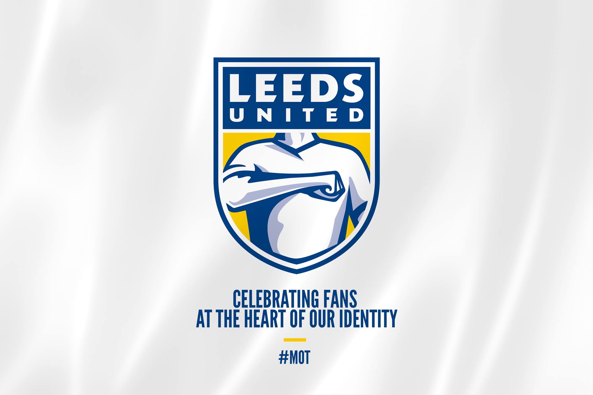
Minutes after the big reveal on social media, the Elland Road club found themselves at the centre of an angry Twitterstorm, where hundreds of fans vented their furious reaction towards the new design, labelling it “a monstrosity”, “an embarrassment to the club” and “atrocious” to use some of the milder words being used to describe it.
It wasn’t just Leeds fans who were looking at this new crest with bemusement either, with fans of other clubs branding it “horrific”, “a state” and some even wondering whether it was a very early April Fools joke.
Leeds United on the other hand have been positive about the new look, and said in a statement:
“We are now delighted and proud to reveal a new crest that represents the passion and the unique identity that runs deep through the Club.
The new crest depicts the ‘Leeds Salute’, which over the decades has been an expression of the passion that connects Leeds United’s fans and players on and off the pitch and all over the world.”
Early indications show that this may go down as a monumental disaster of a rebrand, and In light of this, we’ve decided to take a look at some more rebrand failures.
-
GAP
Clothing retailer GAP famously revealed a new logo on 6th October 2010. Less than a week later, it had gone and the old logo was reinstated.
![]()
At the launch of the new logo, angry customers took to social media to complain about the new look, Gap listened to the criticism and made the quick decision to change it back to the old logo, which had previously worked for years.
-
Netflix
Not many people know about this one, but Netflix attempted a rebrand a few years back, although only in the US. Their plan was simple: split the brand in two and operate one side as a streaming service, known as Qwikster, and the other as a DVD mailing service, similar to LoveFilm, which would remain Netflix.
![]()
Needless to say, the vast majority of customers were left wondering why NetFlix made this decision, and labelled it “pointless” and “confusing”. Fortunately, NetFlix abandoned the plan and it remained under the one brand name.
-
McDonald’s Happy Meal
Not so much of a rebrand, more a failed introduction of a mascot. If you’ve not seen it before, here’s Happy.
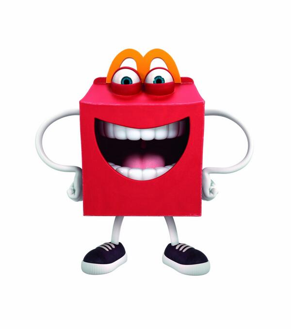
Although supposedly based on the lovable minions from Despicable Me, Happy seemed to lack the ability to bring happiness, laughter and joy to children which the small, yellow troublemakers do, and instead made them cry and want to leave the restaurant.
On his arrival in the US, McDonald’s said in a statement: ““At McDonald’s, we’re always looking to bring fun and happiness to families and listening to our customers’ asks to have more variety and wholesome options for kids to enjoy in their Happy Meals”.
As Happy has been rarely seen since it’s likely that Mcdonald’s decided against using him on a regular basis.
-
Pepsi
Pepsi are no strangers to a rebrand but in 2008 they reportedly spent $1m on a rebrand which seemingly only rotated the icon slightly, and skewed the white part a little.
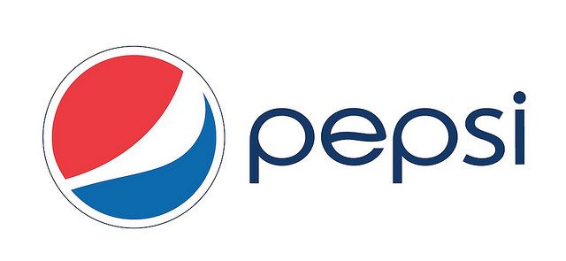
That seems a lot of money for something so minor!
-
Royal Mail
In 2001, Royal Mail announced a new company and brand named ‘Consignia’.
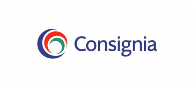 The reaction was less than positive, with journalists such as the BBC’s Mike Verdin calling it “a howling waste of money.”. At an estimated cost of £2million, he wasn’t wrong. Just 15 months later, the UK’s largest mail carrier ditched the Consignia brand and reverted to its traditional name.
So it seems that even the biggest brands in the world can get rebranding wrong, it doesn’t matter whether you’re a retailer or a service provider, or how much you spend on it, it can still go wrong.
When doing a rebrand, it’s essential to remember three key things:
- Does it add to my brand? Is it necessary?
- Have I done my research – what does my audience think of the change? Has my research been extensive enough?
- Don’t be afraid to ask for help!
Here at Wild PR, we’ve worked on many rebrand projects with clients which have all been very successful. If you’re considering a rebrand, or have already done a rebrand of your company and need help getting in front of your audience, then get in touch with us today and see how we can help.